Plotly Dash vs PowerBI: Which one is better for healthcare applications?
Authors: Xi Zheng, Ashish Gupta
Find out which tool, PowerBI or Python Plotly Dash, suits your needs best through a detailed, experience-based comparison
🎏 Introduction
In the realm of data visualization and business intelligence, choosing the right tool can significantly impact how effectively data insights are communicated and presented. This blog post will share experiences building a dashboard for medical center encounters using two popular platforms: Plotly Dash and PowerBI. The goal is to provide a comprehensive comparison based on practical experiences to help you decide which tool might be best for your needs.
🎏 Overview of Plotly Dash and PowerBI
Plotly Dash
Plotly Dash is an open-source framework for building analytical web applications in Python. It allows developers to create interactive dashboards with customizable components and is known for its flexibility and integration with Python’s data manipulation libraries.
- Key Features:
- Open-source and free to use
- Integration with Plotly library for data visualization
- Interactive web-based dashboards
- Extensive customization options
- Typical Use Cases:
- Custom data applications
- Complex, interactive visualizations
- Python-centric data environments
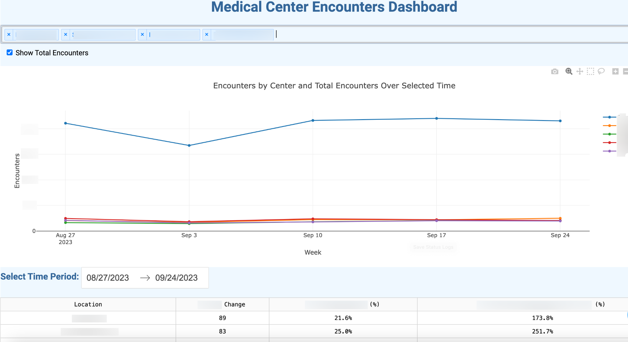
- Sample Dashboard:
- Note: The data used for the dashboard is mock data without any real-world significance.
PowerBI
PowerBI is a business analytics tool by Microsoft that provides interactive visualizations and business intelligence capabilities. It offers a user-friendly interface and integrates seamlessly with other Microsoft products.
- Key Features:
- User-friendly interface
- Rich visualization library
- Easy data integration
- Strong community and support
- Typical Use Cases:
- Business intelligence and reporting
- Data exploration for non-technical users
- Enterprise-level data analysis
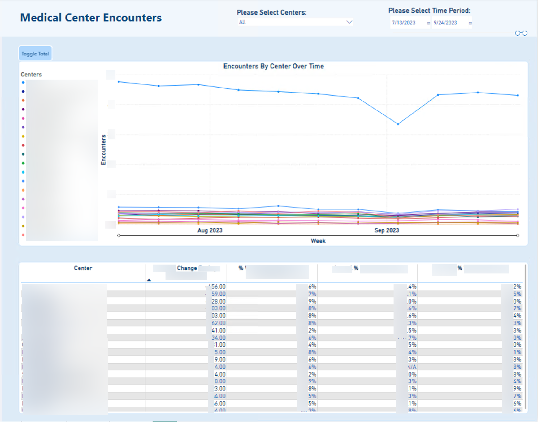
- Sample Dashboard:
- Note: The data used for the dashboard is mock data without any real-world significance.
🎏 Setup and Initial Impressions
Installation and Setup
- PowerBI: PowerBI Desktop can be downloaded and installed easily from the Microsoft website. The setup is quick, and the interface is intuitive, making it accessible for users with varying technical backgrounds.
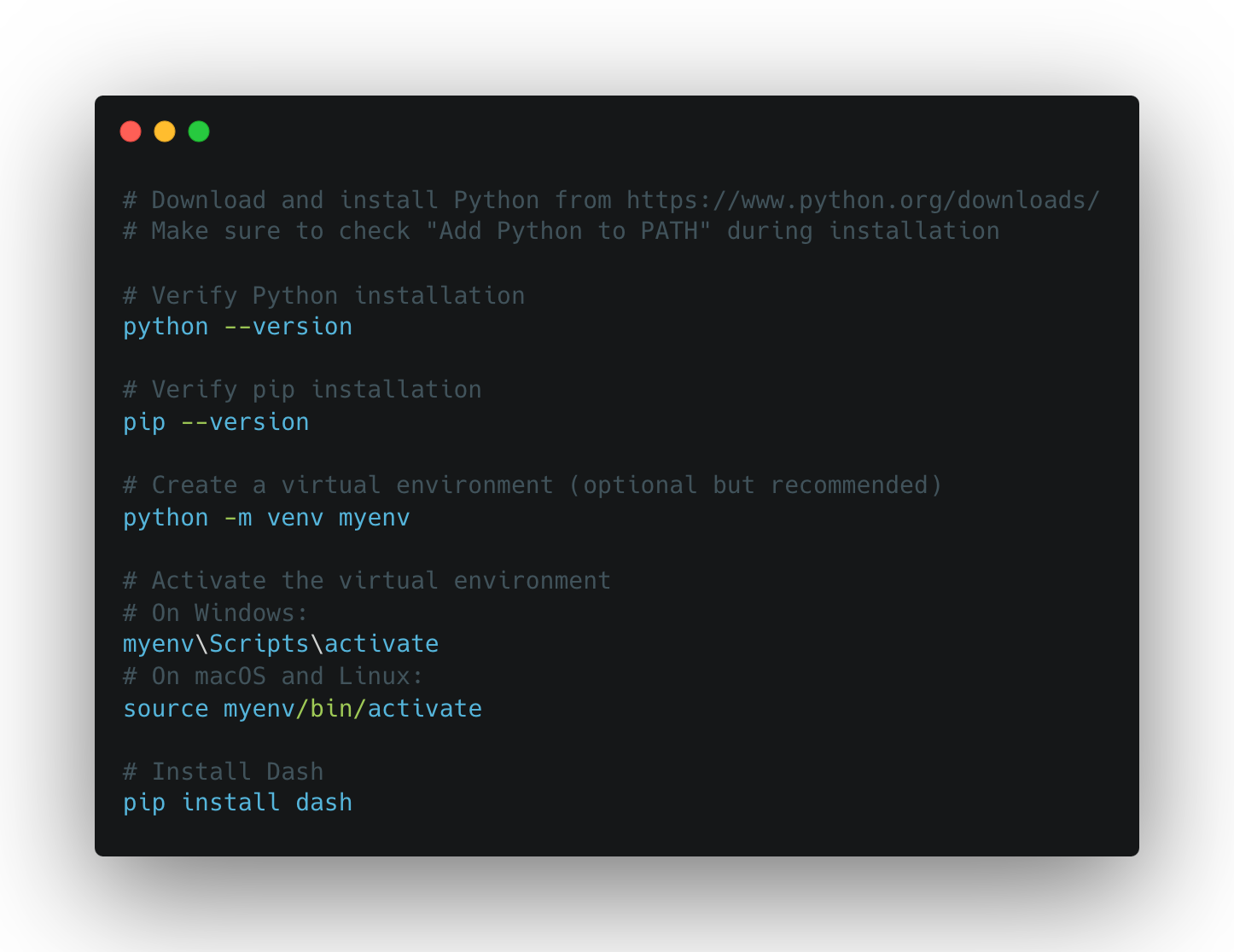
- Plotly Dash: Installing Plotly Dash requires setting up a Python environment and installing the Dash libraries. It’s straightforward for those familiar with Python but might be challenging for beginners.
- Here are the sample command lines that can help with the Plotly Dash set up
Initial Learning Curve
- PowerBI: PowerBI’s drag-and-drop interface and built-in tutorials make it easy for new users to create their first dashboard without needing extensive technical knowledge.
- Plotly Dash: The initial learning curve can be steep due to the need for programming knowledge. However, extensive documentation and examples are available to help users get started.
🎏 Data Handling
Data Integration
- Plotly Dash: Data integration is highly flexible. You can connect to various data sources leveraging Python libraries (e.g., pandas, SQLAlchemy).
- PowerBI: PowerBI offers built-in connectors to a wide range of data sources (e.g., Excel, SQL Server, Azure). It’s straightforward and requires minimal setup.
Data Transformation and Preprocessing
- Plotly Dash: Data transformation and preprocessing can be done in Python, giving you full control over the process.
- PowerBI: PowerBI provides Power Query for data transformation, which is user-friendly and powerful for most common data preparation tasks. It also has the Python script editor embedded, which allows data manipulations in Python (e.g. pandas and matplotlib libraries are supported to be installed). However, the Python script editor does come with some limitations about the data size, execution time, memory, libraries, and data reload frequency, which may restrict some data manipulation capabilities in Python within the PowerBI.
🎏 Building Dashboards
Plotly Dash
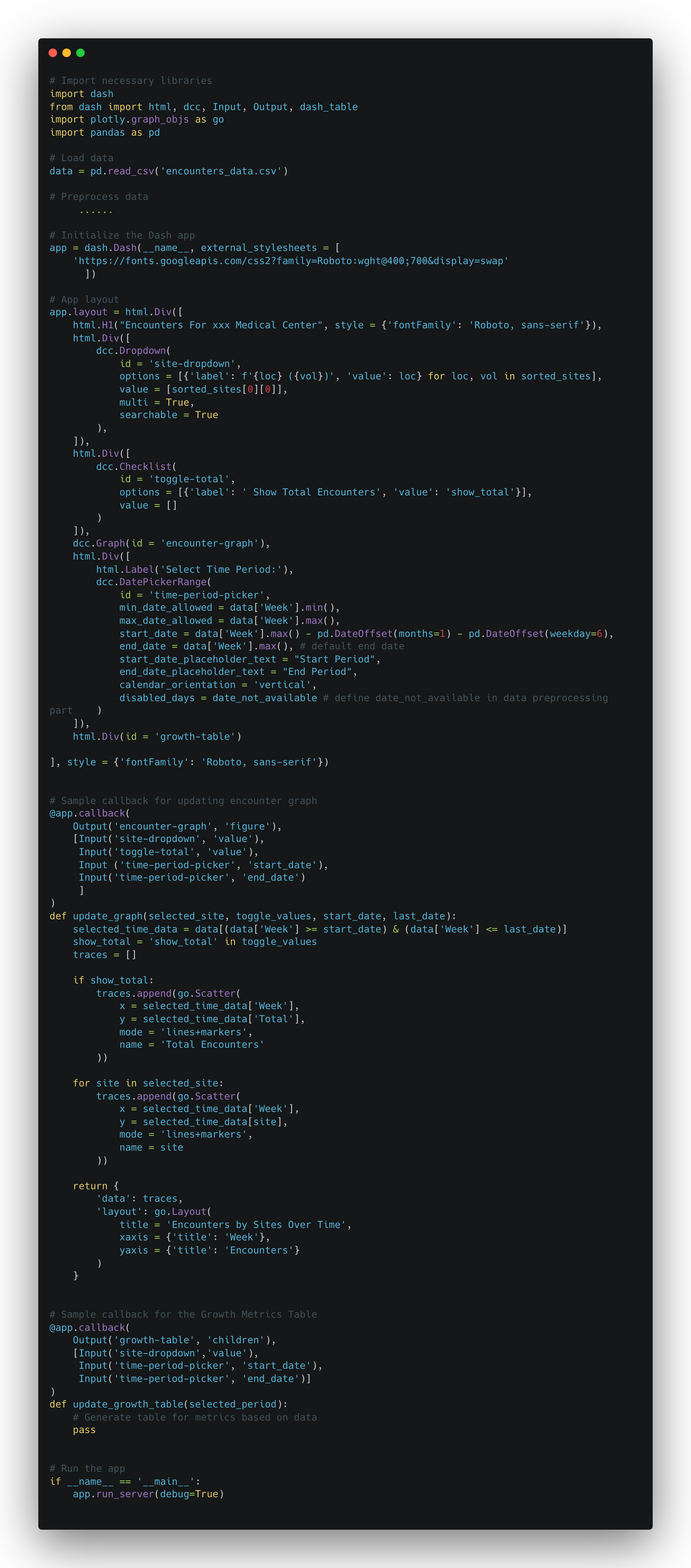
To build the dashboard for medical center encounters, in Plotly Dash, the codes are written in Python to create each component: two filters/slicers for site and timeframe selections respectively, a line chart for trend analysis, and a table for statistical summaries.
- Steps to Create the Dashboard:
- Setup: Import necessary libraries, load and preprocess data.
- Layout: Define the layout using Dash components.
- Interactivity: Use callbacks to add interactivity to the filters/slicers and update the charts and tables based on user input.
- Sample Code Snippets:
- Python Code Breakdown and Explanations For Each Component:
- Dropdown For Location Selection
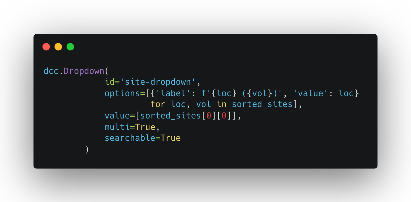
- Achieved by adding the component called ‘dcc.Dropdown’ to the layout, and setting up the callback function to link it with other visuals.
- It allows you to select specific sites (the sites in the example are sorted based on the amount of encounters beforehand as ‘sorted_sites’), and filters both line chart and table to the sites that you are interested in. You can select as many locations as you want.
- Show Total Volume toggle
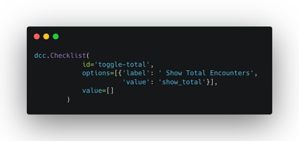
- Achieved by adding a component called ‘dcc.Checklist’ to the layout, and setting up the callback function to link it with the line chart in the sample dashboard.
- It allows you to hide or show the line representing the total encounters on the line plot, which can avoid the situation that the total line is dominating and makes it hard to see the trends of other lines. The toggle provides the options and makes the plot more tidy.
- Time Period Picker
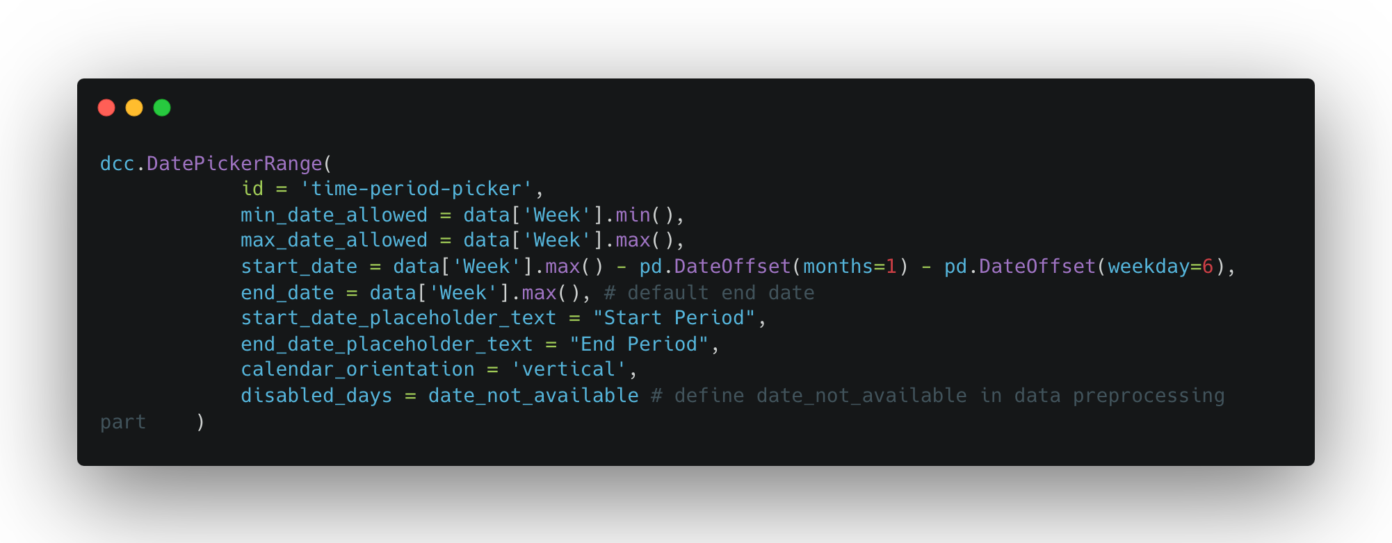
- Achieved by adding a component called ‘dcc.DatePickerRange’ to the layout, and setting up the callback function to link it to other visuals.
- It allows you to choose the time range that you would like to focus on, and with being linked to other visuals (such as line plot and table in this sample dashboard), it can emphasize (zoom-in) the details only during the period that you are interested in.
- Line Plot
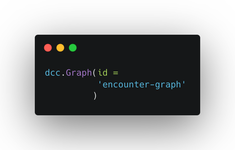
- Achieved by adding a component called ‘dcc.Graph’ to the layout, and plotting the line graph using the regular “plotly” package, then leveraging the callback decoration to realize the interaction.
- It allows you to intuitively see the overall trend of data, which makes it easier to identify the pattern and unusual points in the data over time. Additionally, it’s worth noticing that plotting the line graph with the "plotly" package allows you to view tooltips only for the line you're hovering over, making the line graph clear and more efficient.
- Table
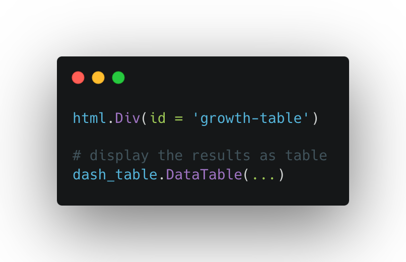
- Achieved by defining a table in the layout as a placeholder, and using dash_table.DataTable() to display the results in the table form.
- It helps to show the detailed statistical summaries and defined metrics, and being especially helpful when the trend is stable without lots of fluctuations.
PowerBI
Creating the same dashboard with the same components in PowerBI involved using its drag-and-drop interface to configure the slicers, line chart, and table.
- Steps to Create the Dashboard
- Layout: Decide the overall layout of the dashboard and drag-drop each component to the appropriate position
- Sample components
- Slicer For Sites Selection: Use built-in slicer visual, then add ‘Sites’ as the value for the visual
- Slicer For Timeframe Selection: Use built-in slicer visual, then add ‘Week’ as the value for the visual
- Line Chart: Use built-in line chart visual, then drag corresponding fields for x-axis, y-axis, and legend for the visual. In the example case, ‘Week’ for x-axis, ‘Encounters’ for y-axis, and ‘Sites’ for legend. However, the default tooltips for the built-in line chart component display information for all legend lines rather than just the one you're hovering over, making it harder to distinguish between the lines. Thus, compared to the line graph in Plotly Dash, it is less flexible and will require more efforts to build the customized tooltips.
- Total Toggle For Line Chart: There is no built-in toggle/checkbox visual, which will lead to some challenges for adding the toggle function. One workaround used to simulate the toggle function for this example dashboard is that creating two identical line charts at the same position, one is with the ‘total’ line shown, the other is without the ‘total’ line shown. Then, use button and bookmark to switch between two line charts when user clicks, which can simulate the toggle effects.
- Table: Use built-in table visual, create necessary measures in DAX for the calculations of growth metrics, then drag the corresponding fields and measures as the values for the table columns.
By comparing the process of building the dashboard with each component, it becomes clear that Plotly Dash is more suitable for components requiring customized functions, as it simplifies achieving the desired goals. In contrast, PowerBI's built-in components are harder to modify, making customization more challenging. However, for basic components that don't need customization, using PowerBI's built-in components saves time and achieves the same results as Plotly Dash. In this example dashboard, since it doesn't require extensive customizations and workarounds can be accepted, PowerBI was chosen due to its simplicity and efficiency in building the dashboard for medical center encounters.
🎏 Deployment and Sharing
Deployment
- Plotly Dash
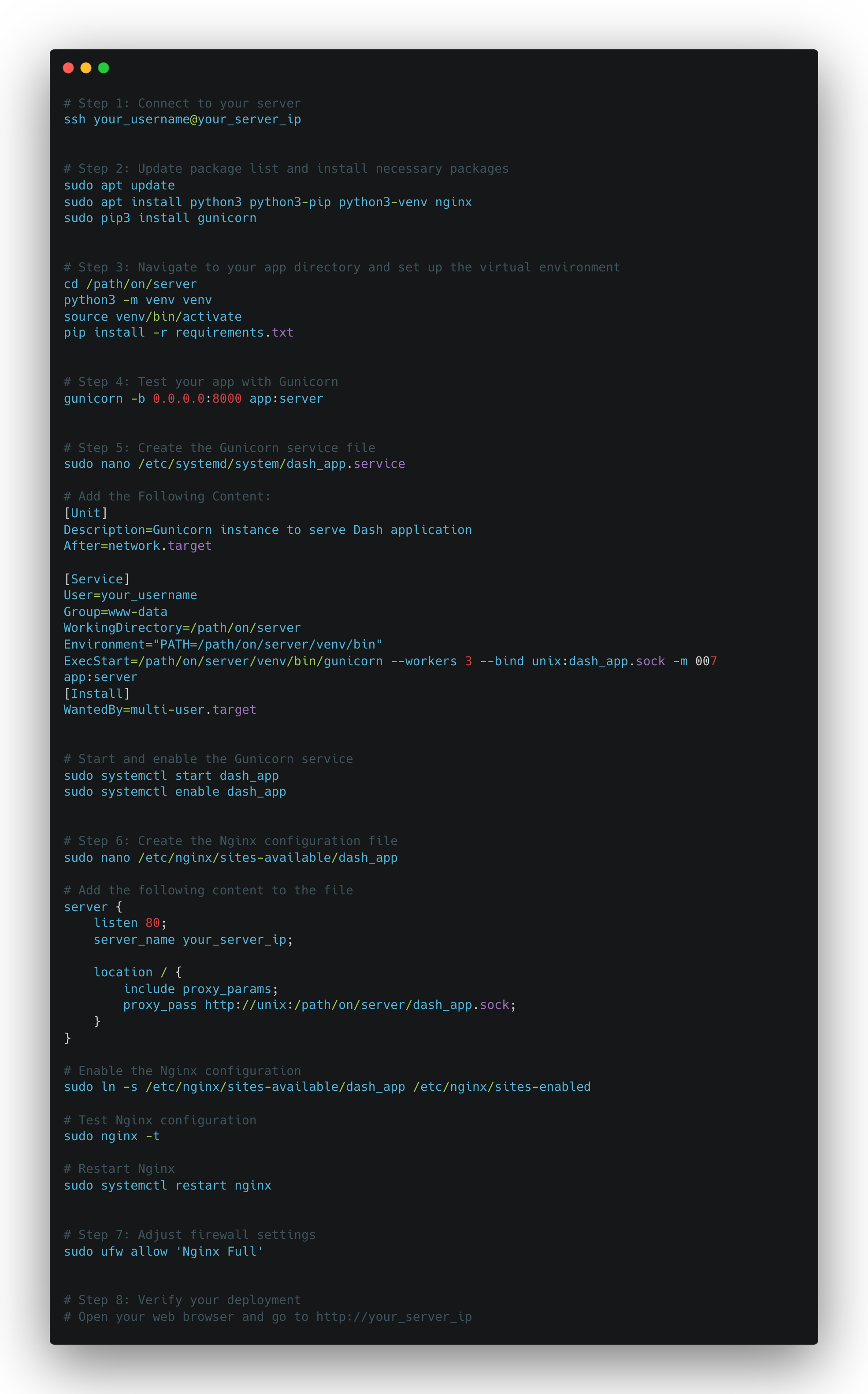
- Dash applications can be deployed on various platforms (e.g., Heroku, AWS), and it requires some setup and configuration. For this example dashboard, it’s deployed in the production environment on a Linux-based server, using Gunicorn and Nginx.
- Here are sample command lines that can be followed to deploy the Plotly Dash app that you build (Need to modify and replace the name/path by your actual dash app):
- PowerBI
- PowerBI reports can be published to PowerBI Service by clicking ‘Publish’ in the PowerBI desktop, and shared with users easily.
Authentication and Sharing
- Plotly Dash
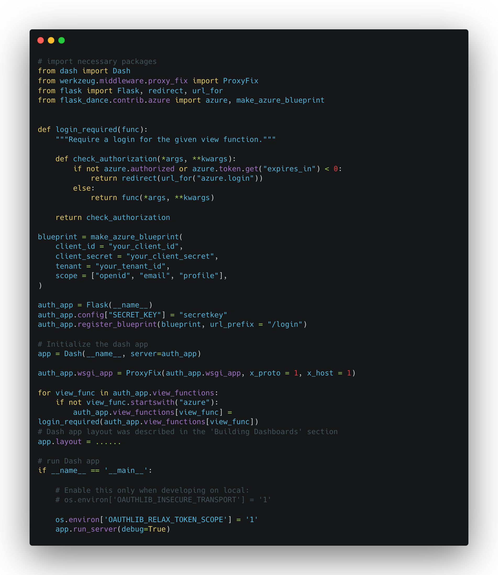
- Sharing of the Plotly Dash requires setting up web servers and ensuring access control (authentications). For the access control, Dash Enterprise also provides the http basic authentication to protect the dashboard.
- For this example dashboard, since the target users are all being Microsoft users, thus, the Single Sign-On (SSO) is implemented via Azure Active Directory (AAD) to control the access to the deployed dashboard.
- Here are some sample codes that show how the SSO can be implemented with AAD authentication: (Note: Cited from https://dev.to/kummerer94/aad-auth-for-plotly-dash-3m57)
- PowerBI
- PowerBI provides seamless sharing and collaboration features, including workspaces and sharing links, which ensures the access security and realize the access control.
By comparison, deploying and authenticating a dashboard in PowerBI is significantly easier and requires less effort than with Plotly Dash. PowerBI provides a streamlined, user-friendly interface for publishing and sharing dashboards, with built-in authentication and sharing options that integrate seamlessly with other Microsoft services. This ease of use makes PowerBI an attractive option for organizations seeking quick and efficient deployment.
On the other hand, Plotly Dash, while offering greater flexibility and customization, lacks well-defined best practices for free authentication and sharing solutions. This can present a challenge, as setting up secure authentication and sharing mechanisms often involves additional complexity and resources. Consequently, this free authentication limitation of Plotly Dash becomes a notable weak point when comparing it to PowerBI, especially in terms of our final decision on which platform to use.
🎏 Cost and Licensing
- Plotly Dash
- It’s open-source and free to use. Commercial support and enterprise solutions are available at a cost.
- PowerBI
- PowerBI Desktop is free. PowerBI Pro and PowerBI Premium require subscriptions, with additional costs for advanced features and collaboration.
🎏 Community and Support
- Plotly Dash
- Strong community support with extensive documentation, examples, and forums. Official support is available through Plotly Enterprise.
- PowerBI
- Large and active community with numerous resources, tutorials, and forums. Comprehensive official documentation and support from Microsoft.
🎏 Conclusion And Our Pick
In summary, both Plotly Dash and PowerBI are powerful tools for creating data visualizations and dashboards. Plotly Dash offers flexibility and control for those comfortable with coding, while PowerBI provides a user-friendly experience with strong integration and sharing/authenticating capabilities. Your choice between the two will depend on your specific needs, technical expertise, and budget.
Our PowerBI Choice Explained
For this practical example case, due to the time sensitivity, we decided to use PowerBI as the final platform to build our medical center encounters dashboard. The decision was based on the nature of this example dashboard, which doesn’t require too many customizations, and the ease of deployment and authentication in PowerBI.
Pros and Cons Summary
- Plotly Dash
- Pros:
- Open-source and free to use
- Since the Plotly Dash is python-based, it has all the pros of using python to manipulate and process data. We can leverage the extensive packages like pandas, numpy to achieve most of the requested data analysis. Since it’s python-code based, the debug process will also be familiar to the python user.
- It has high flexibility to customize the layout and components on the dashboard, which will be suitable for complicated analysis.
- It has very detailed and well-documented documentation, and has a large community of developers, so it’s quite feasible to find the answers to the questions we might face during the development.
- Cons:
- Steeper learning curve, it has no built-in functions like PowerBI, so even for basic visuals, you need to write the code for them from scratch
- Deployment, authentication, and sharing can be complex and requires programming knowledge
- It has limitations on the usage of the existing tools (e.g. The ‘RangeSlider’ is not suitable for picking the time range)
- Pros:
- PowerBI
- Pros:
- It boasts a highly intuitive drag-and-drop interface, making it accessible for users with varying levels of technical expertise
- It comes equipped with a wide range of built-in visualizations, including slicers, charts, graphs, and maps. These tools enable users to create interactive reports with less time required
- As a Microsoft product, PowerBI integrates effortlessly with other Microsoft services such as Excel, Azure, and SQL Server. This integration streamlines data import, and sharing processes with either team members or external stakeholders
- Cons:
- Though PowerBI Desktop is free, advanced features and collaboration capabilities require a subscription to PowerBI Pro or PowerBI Premium. For organizations with many users, these costs can accumulate quickly.
- PowerBI is primarily designed for ease of use and rapid development, thus, it can limit the flexibility needed for highly specialized or unique data visualization requirements.
- It has certain limitations in handling very large datasets directly within the desktop application. Users may need to rely on external data preparation and storage solutions, such as Azure, to manage extremely large datasets effectively.
- Pros:
🎏 Additional Resources
Plotly Dash
https://dev.to/kummerer94/aad-auth-for-plotly-dash-3m57
PowerBI